When Toronto-based creative and design agency Quake was tapped to reimagine the iconography for two of Hasbro’s key board gaming brands, it knew it had been tasked with an important job.
Though Avalon Hill – the conglomerate’s strategy gaming brand – is not well known to casual gamers, among those who enjoy strategy board games, it is one that has a lot of equity as a game publisher. And Risk, one of its most immediately identifiable games, is often one of the first board games a young person will be introduced to as they enter the hobby. In both cases, the brands are “really quite beloved,” says Barry Quinn, founder and chief creative at the agency.
“This is a huge responsibility as a designer, because we are messing with things that are truly beloved, not just as products but as a fandom,” he explains. “These aren’t just consumers – they’re fans. And we saw it as our responsibility to respect where the brand is coming from, but also, giving them something of where the brand is going.”
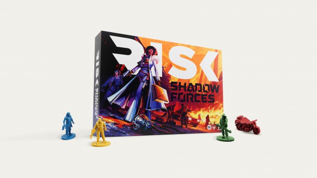
For Risk, the agency sought to create a mark that would work within many different contexts and at many different sizes, while also introducing a visual consistency that the game has lacked.
“Risk is a lot of peoples’ first serious strategy game, and when they play it once, they become lifelong players,” Quinn says. “They may add other games to their collections, but people start playing Risk in their early teens, and then they’ll play it with their kids or elderly parents later in life. But the older identity was not super consistent. A lot of people know Risk with the horse, but there are other versions that have more militaristic logos. It has changed a lot over the years.”
The agency developed a mark that “had the notion of conflict built right into it” – an essential move, since the game is all about “conflict resolution through annihilation,” Quinn adds. Hence, the new logo presents the idea of conflict and warring factions by having “all of the energy in the mark pushing toward the centre.” It also does so “without depicting conflict in a specific way.” This was important, because there are different versions and extensions to Risk, so the battles can be cavemen taking over ancient versions of the world, or it could be set in space.
 For the Avalon Hill masterbrand, the challenge was different. “People do have a lot of affinity for the brand, but this project was about bringing more people into that tent and having them understand it,” Quinn says.
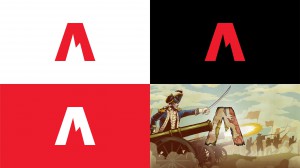
While the old version of the logo employed a simple flag icon, which worked with many of the publisher’s early titles, it didn’t really fit with Avalon Hill’s current identity or “much broader” line-up of products. “We had to develop an identity that applied to those broader worlds while also applying to the identity of the players, which is changing as well.”
Like the Risk logo, the new Avalon Hill emblem had to function at many different scales, and both on printed packaging and game inserts as well as online and on mobile. It also had to “play nice” with the full line of products the brand publishes, from military strategy games such as Risk and Axis & Allies to cooperative horror like Betrayal at House on the Hill to fantasy games such as HeroQuest and Betrayal at Baldur’s Gate.
“The games all have different visual aesthetics,” Quinn elaborates. “It has to work with all of them.”
Quake came to a simple logo that employs a red or white stylized “A,” using the jagged shape of a mountain peak at the top. “This is an identity that could only work for this brand,” Quinn says. “And you can easily read it on top of very complex, graphic backgrounds.”
Both logos are already in market, having fully launched at this year’s Gen Con tabletop gaming convention.


